JuCare
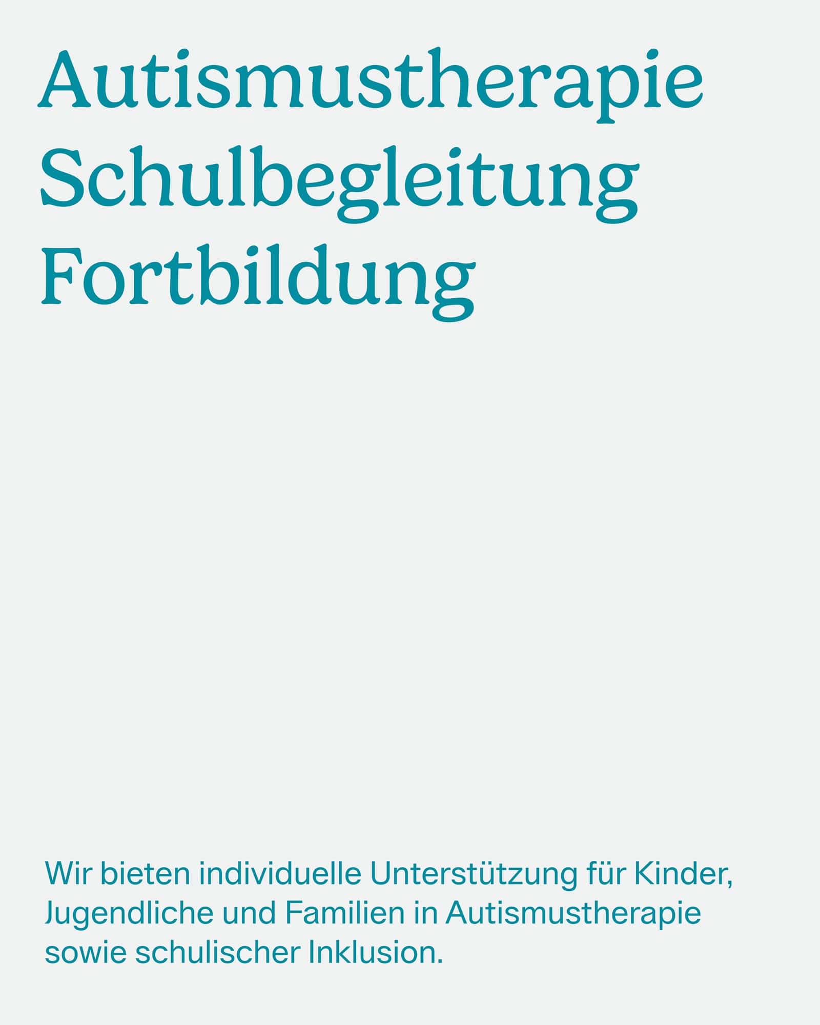
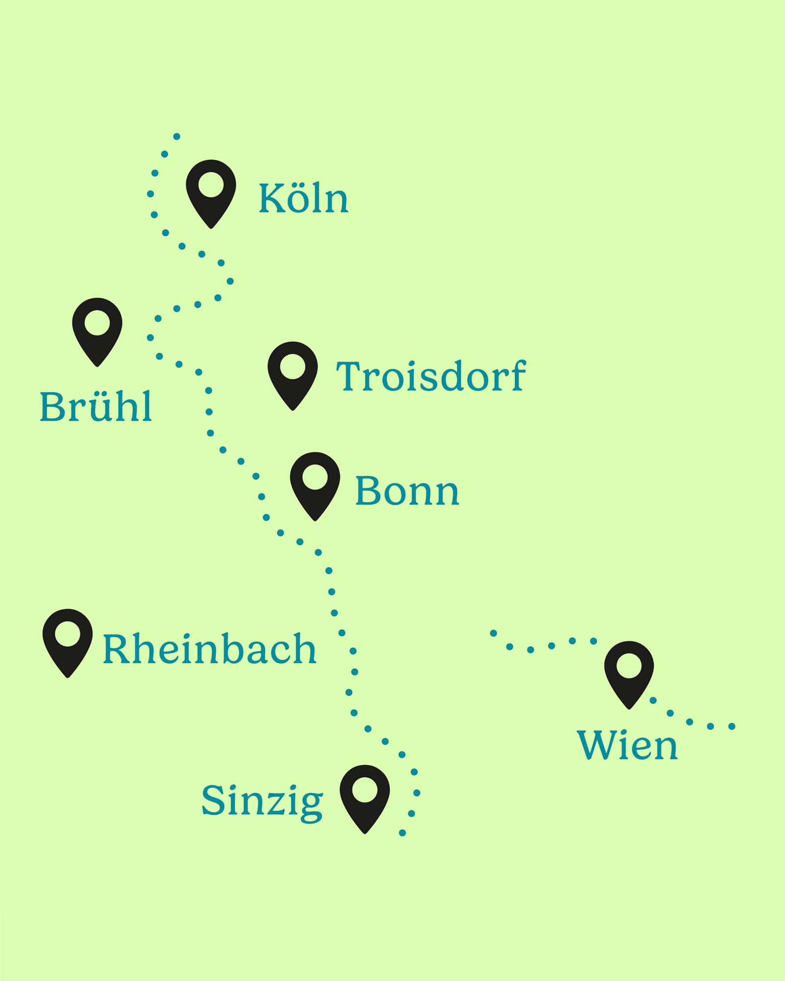
JuCare provides autism therapy, school support, and professional training across seven locations in Germany and Austria. The rebranding process focused on creating a visual identity that reflects both the organization’s expertise and its inclusive, approachable character.
The established core color, petrol, was retained and complemented by two bright, modern accent colors. The resulting color palette feels fresh, friendly and trustworthy.
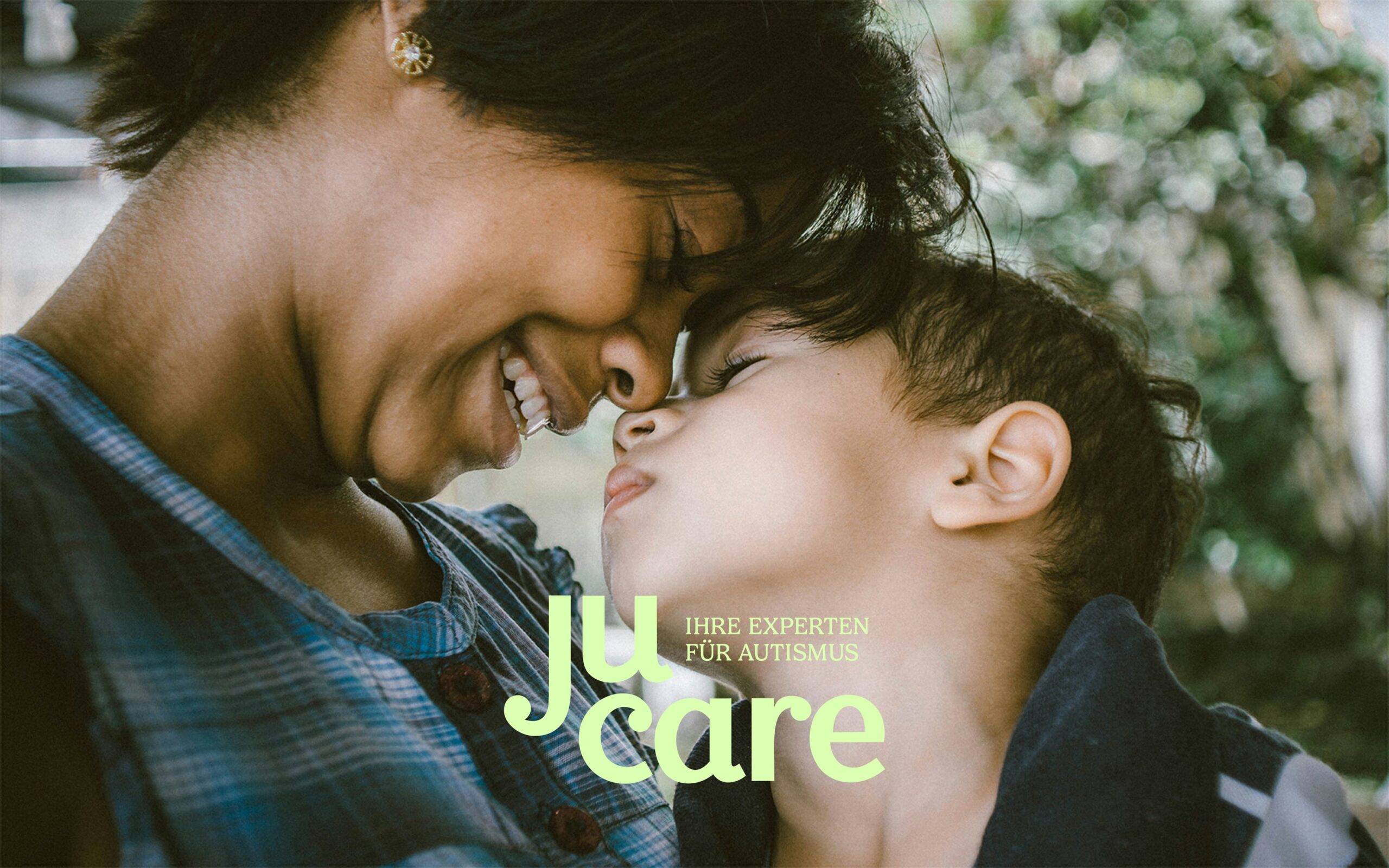
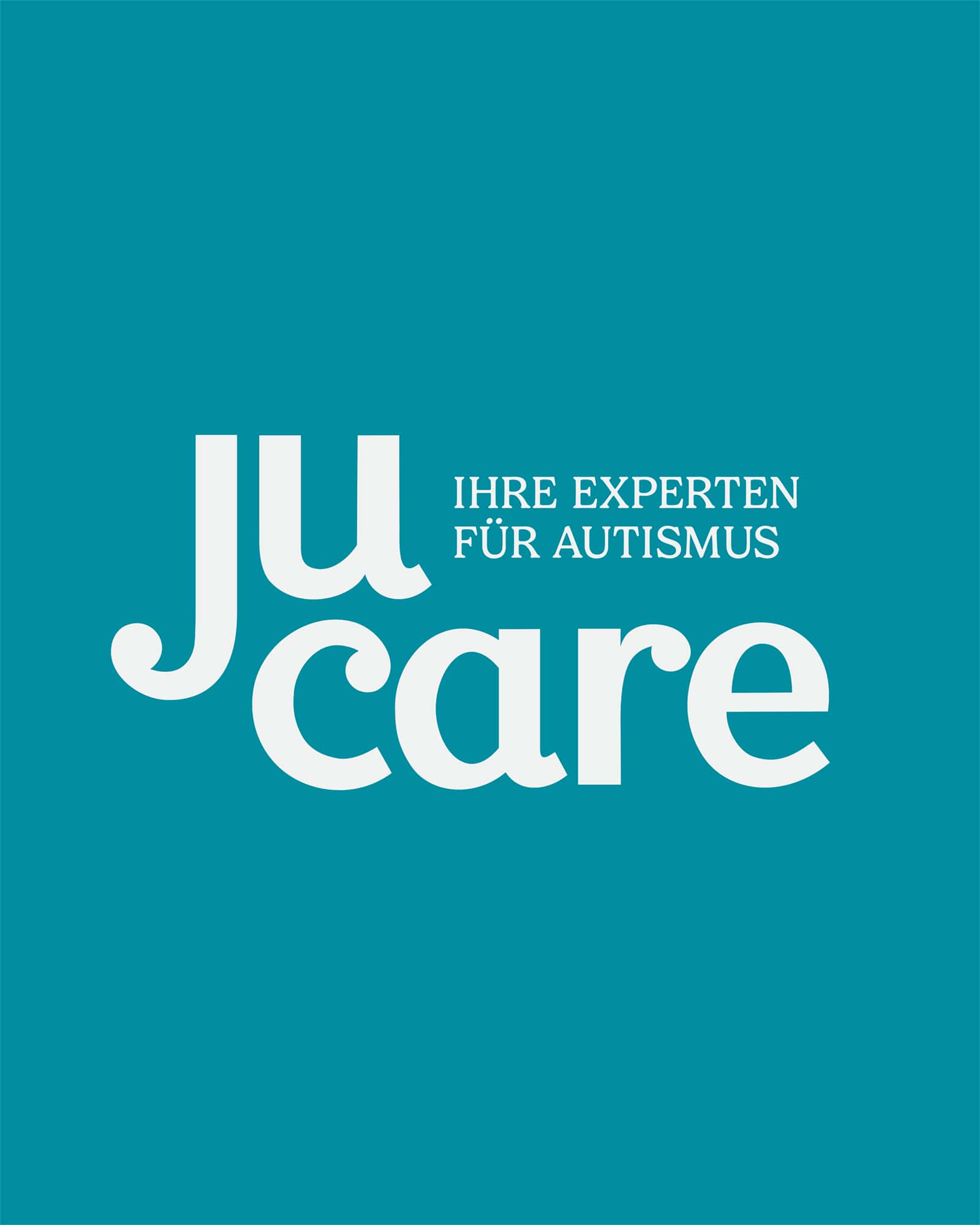
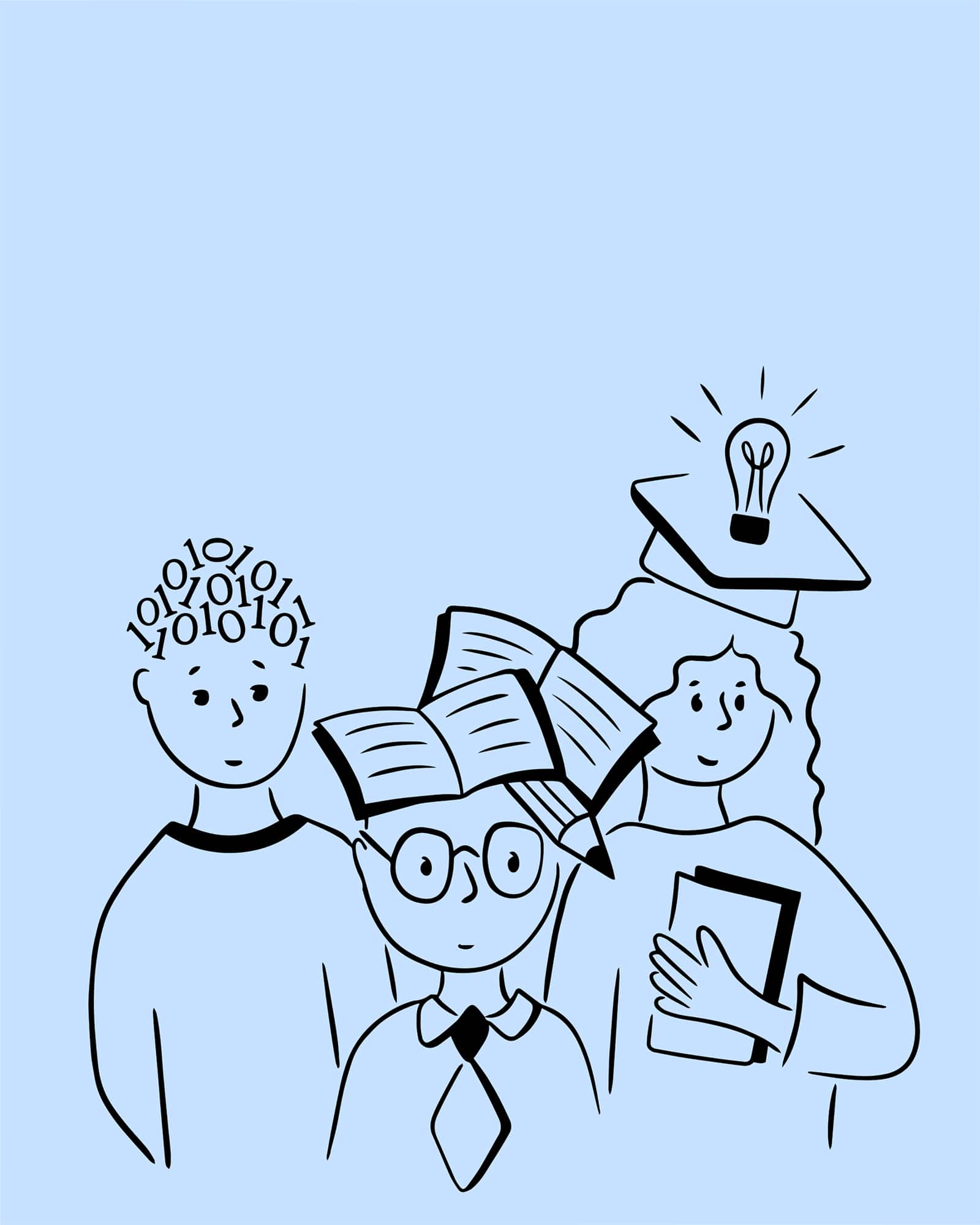
A flexible logo system was created that can be used either with the logo illustration showing the three main areas of JuCare’s work or with the tagline “Ihre Experten für Autismus.”
Client: JuCare
Services: Branding, Corporate Design, Illustration, Web Design, Social Media Design
Year: 2024
Website: www.ju-care.com

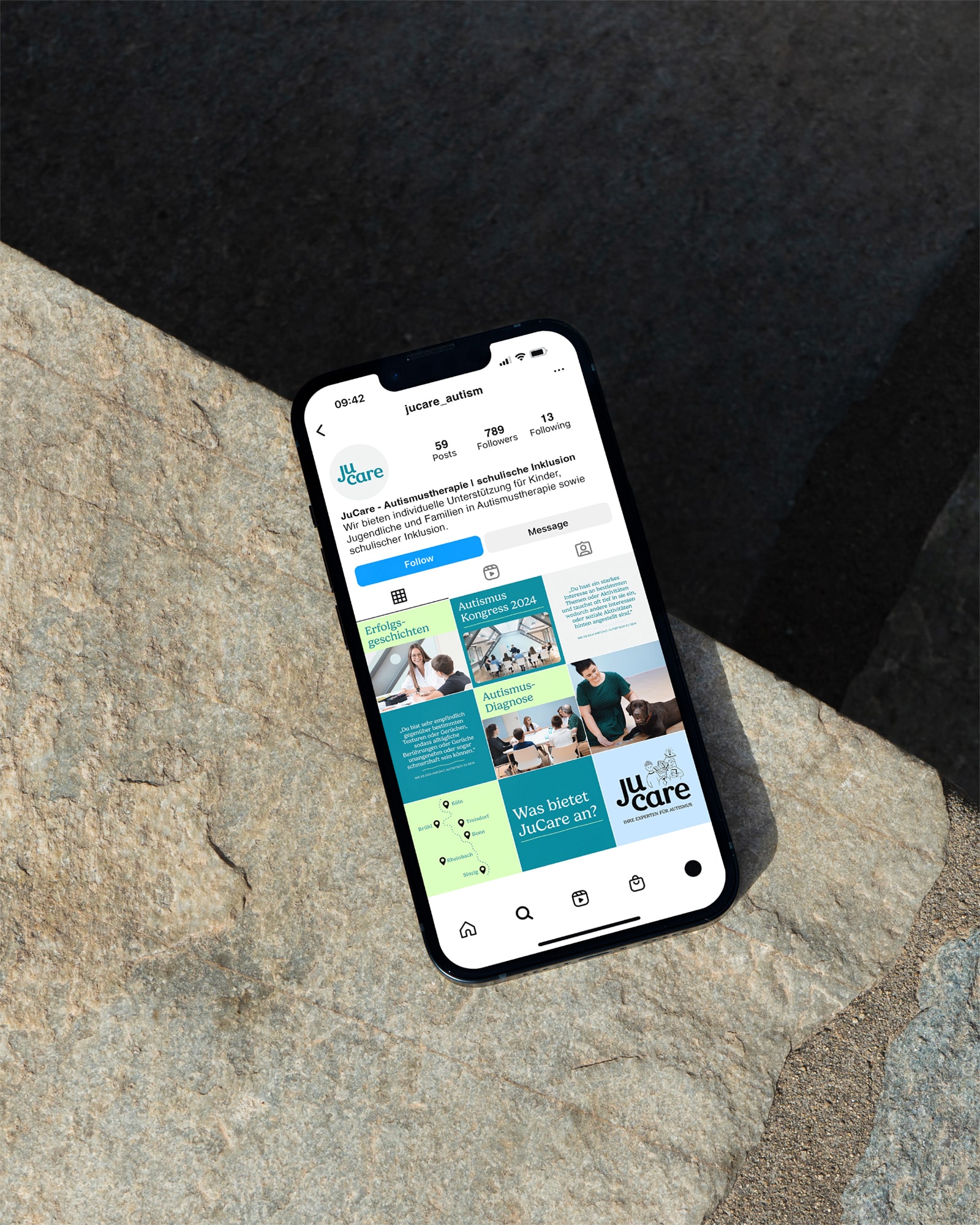

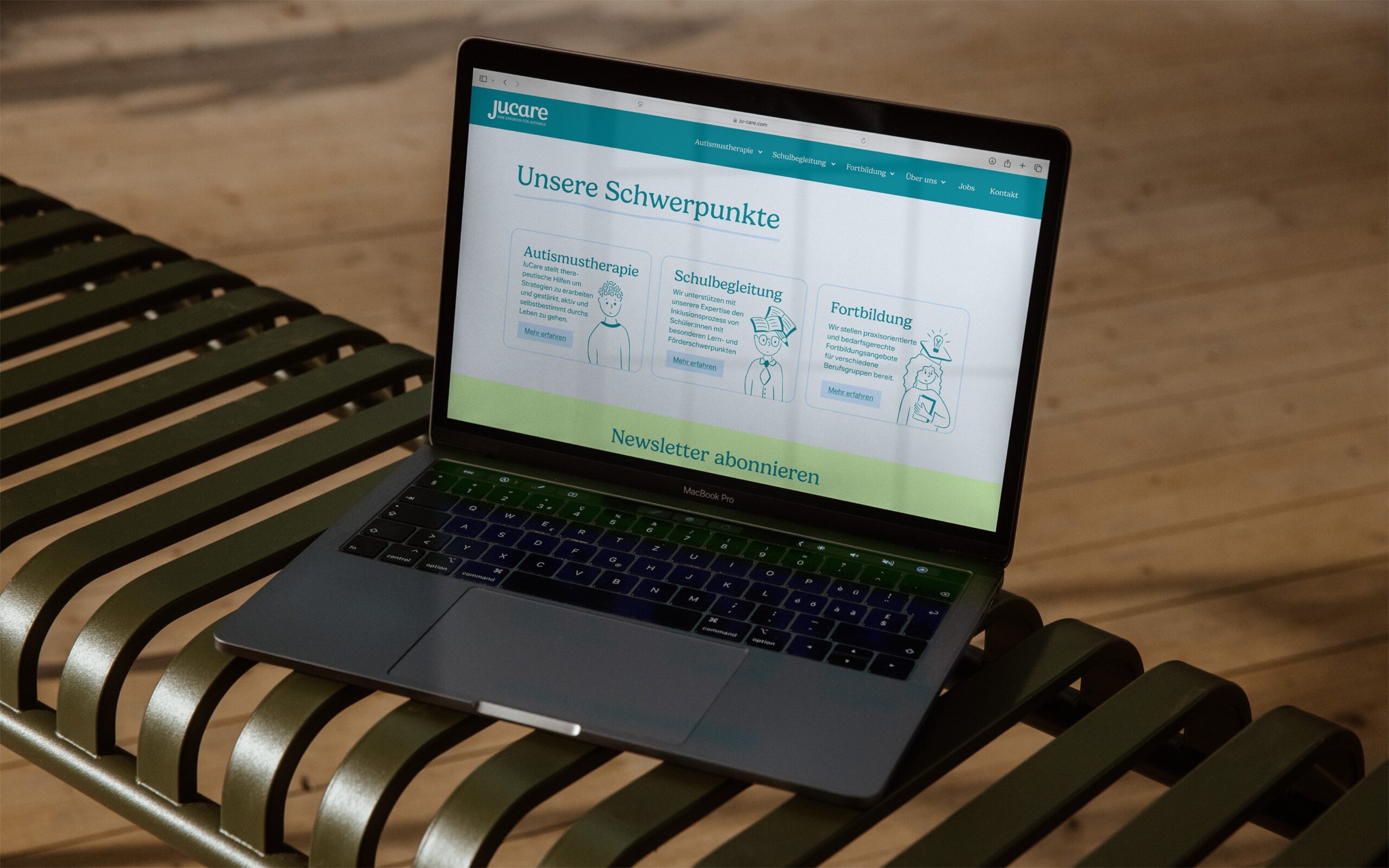
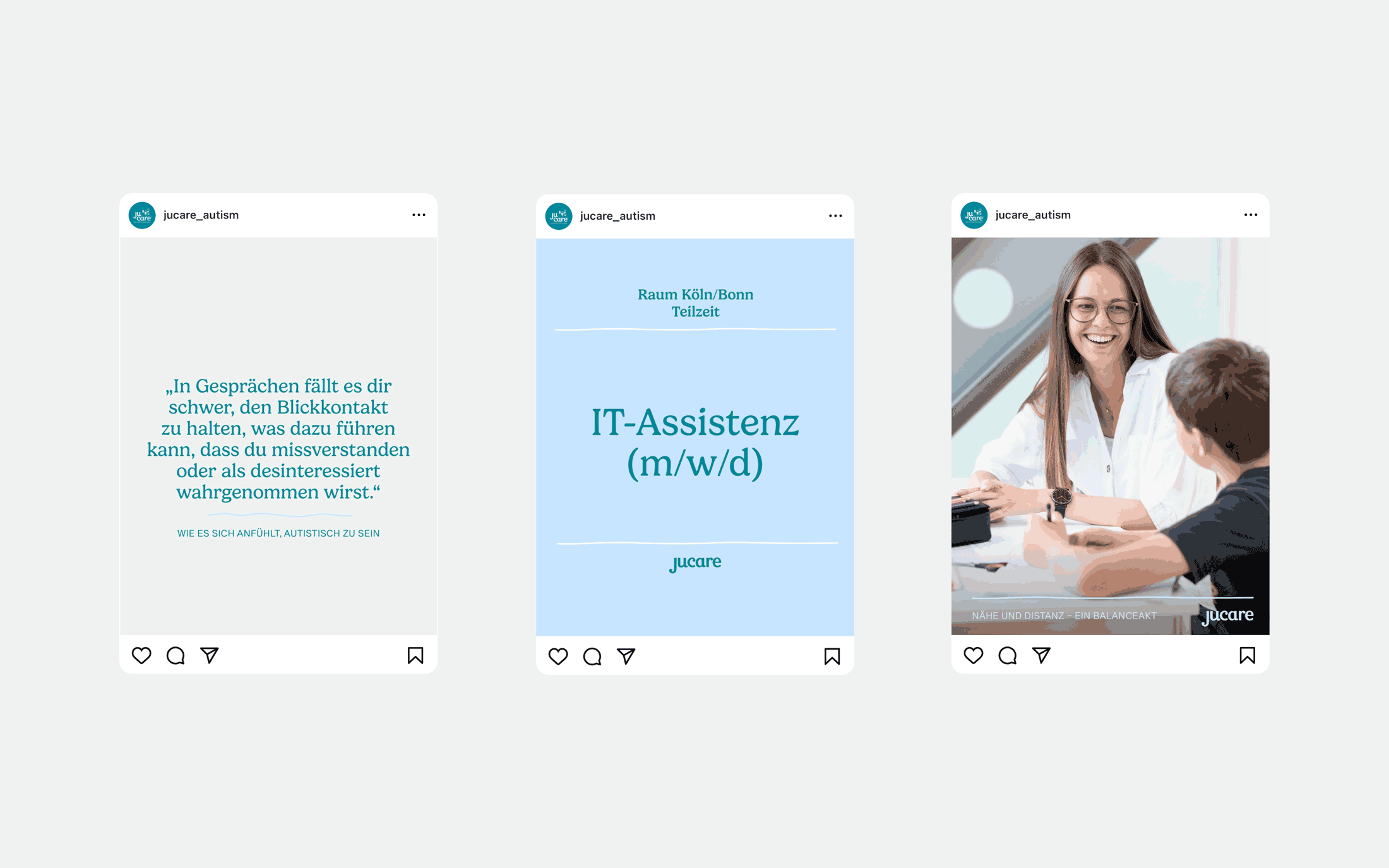
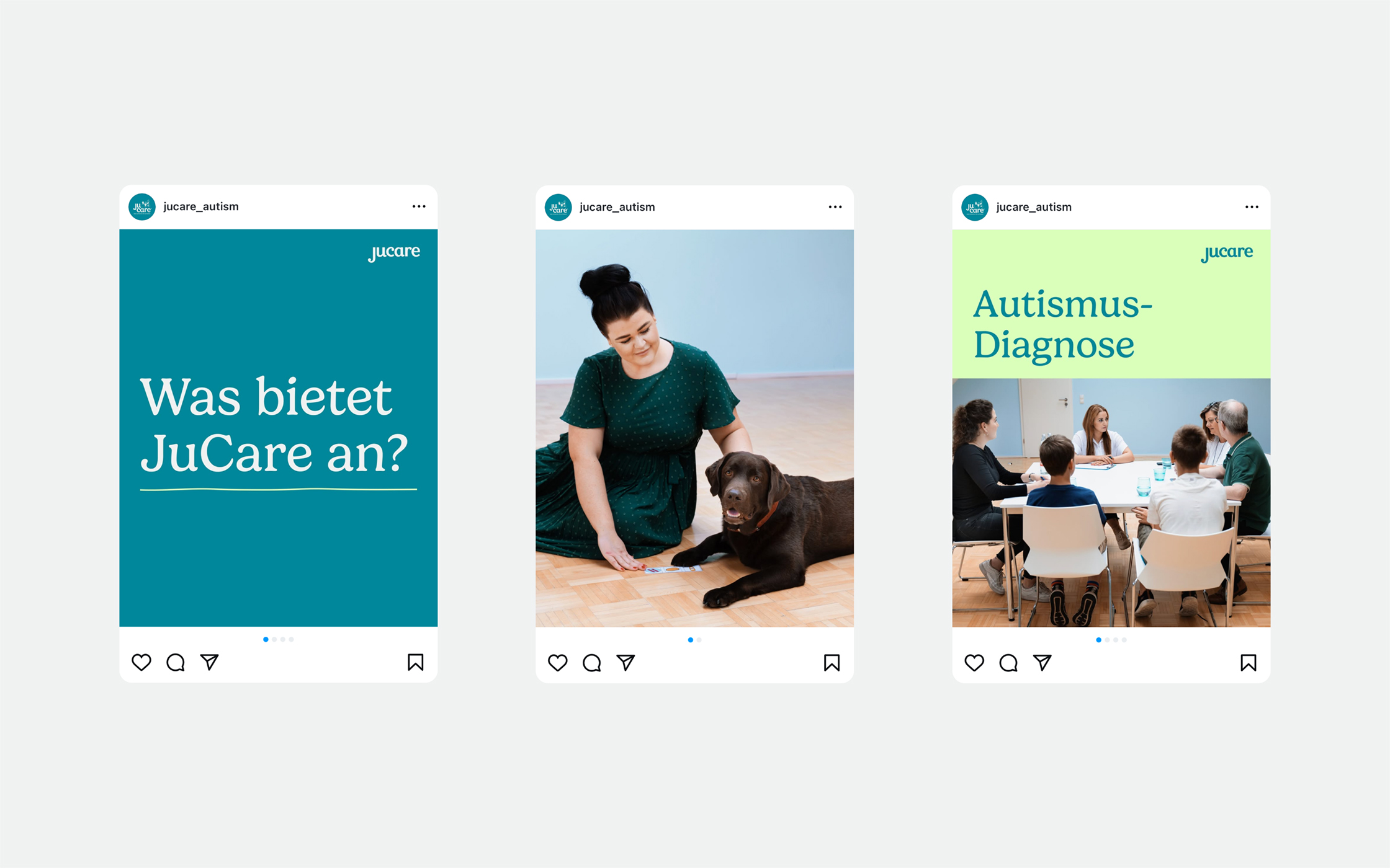
The updated brand identity was translated into a user-friendly screen design. In addition, a set of modular social media templates was created to present quotes, images, and key information in a clear and engaging way for those affected and their families.
The new visual identity combines clarity and credibility with openness and approachability – supporting JuCare’s mission to be a trusted partner for children, young adults, and families on the autism spectrum.
Hans-Sachs-Gasse 12/6, A–8010 Graz
© 2025 – This website is constantly a work in progress ☻